Artists

Interview with Nocturnal Landscapes Painter Chris Hill

Massachusetts-based artist Chris Hill focuses on creating impressively scaled acrylic paintings of the natural world. Leveraging vivid detail to explore the connections between plants and pollinators against the backdrop of a country where industrial farming is the norm, he makes important observations in his work. Chris was previously featured in one of my virtual exhibitions, and recently I took part in a conversation with him to explore his work and process.

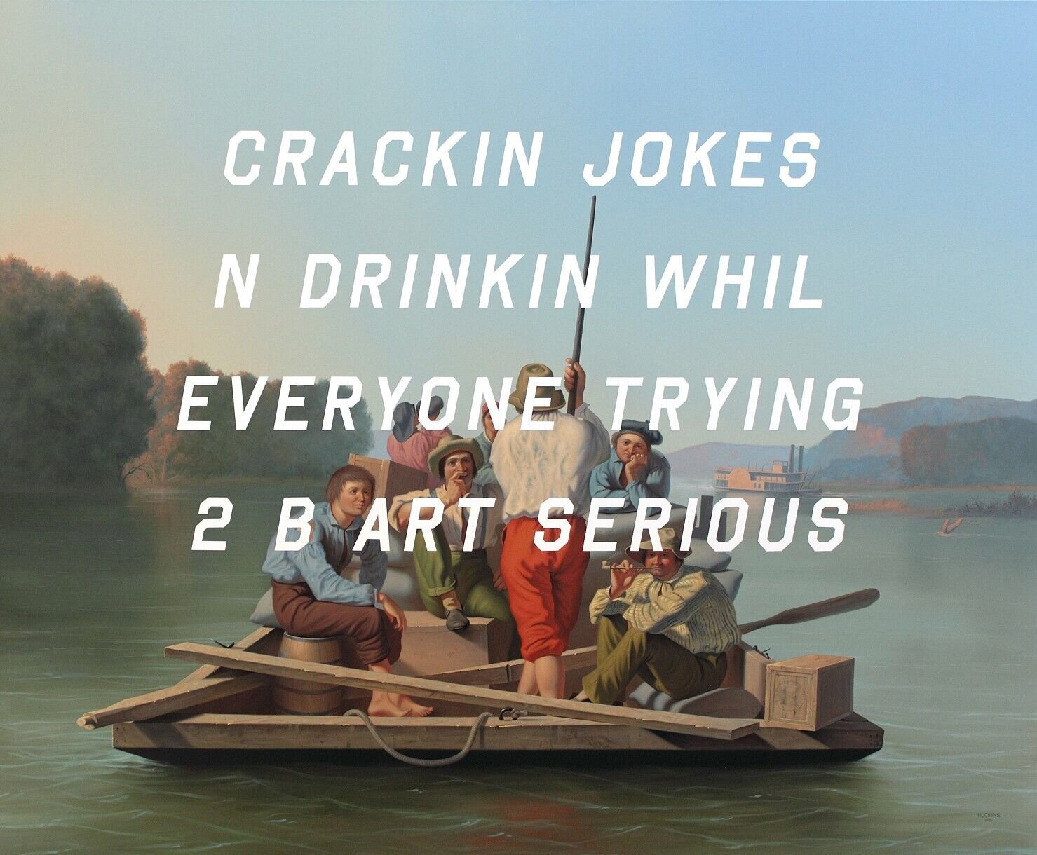
Chris Hill, Before the Spotted Lanternfly, 2022, acrylic on canvas, 60” x 48” (Image courtesy of the artist)

Can you talk a bit about your interest in the natural world and what parts of your background led you to make your Nocturnal Landscapes series?

When I was growing up my favorite hobbies were abstract painting, identifying plants and insects, and walking in the woods. So, when I began to focus on realism, plants and insects were natural subjects for me. Later during my work selling fertilizer I saw many different farms and I was inspired to paint the few that were environmentally friendly.

How do you get started on these paintings? Are you working from nature, from photographs, or a combination thereof?

I compose my scenes from a combination of drawings done in the field and photographs of individual plants and insects. Starting with a black canvas and then the sky, the ground, and then the farthest subjects. The insects are the final layer after all the larger subjects are arranged.

Do you consider your paintings to fall into the genre of scientific illustrations, or are they more expressive than that?

I do strive for accuracy in the anatomy of my paintings, but I wouldn’t say they are scientific illustrations. Sometimes I adjust color, scale and relative perspective as needed. I am more concerned with capturing the spirit of the plant than I am with capturing it’s exact physiology.

Why is the nocturnal element of the landscape important to you?

When I began the Nocturnal Landscapes series, I was living in the middle of a giant, toxic, potato field. The field was sprayed heavily with pesticides, and it was done at night so fewer people were exposed to the clouds of chemicals. So, I began to imagine what the farm might look like at night if it were a healthy ecosystem instead.

How do these paintings interact with other elements of your practice as an artist, or do they?

In addition to working as a carpenter, I enjoy practicing a few different art forms and hobbies, including metal sculpture, writing, gardening, wine making etc. However, I’ve always focused on acrylic canvas painting with a special, crazy obsession. I allow it vastly more time and effort than any other medium. I think it is important to specialize if you want to really master something.

What do you hope viewers experience when looking at this work?

I want my audience to empathize with the natural world; to feel how complex it is, to feel how delicate it is, and to feel how inextricably connected we are to it. 

What is next for you in this series, and how do you expect to build on the ideas you're exploring?

There is infinite inspiration to be found in nature. I’m working on portraying flight, plants swaying in the breeze, atmosphere, and dew among other things. Nature is never static. I’m always looking for new ways to capture motion and growth.

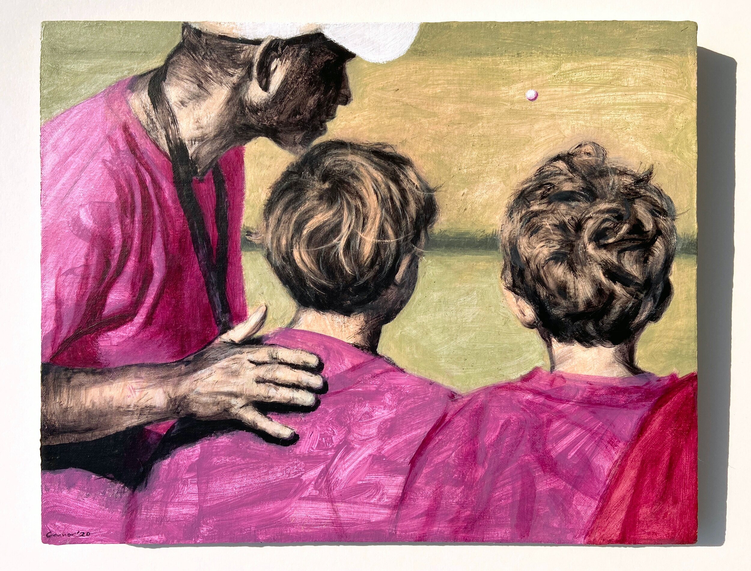
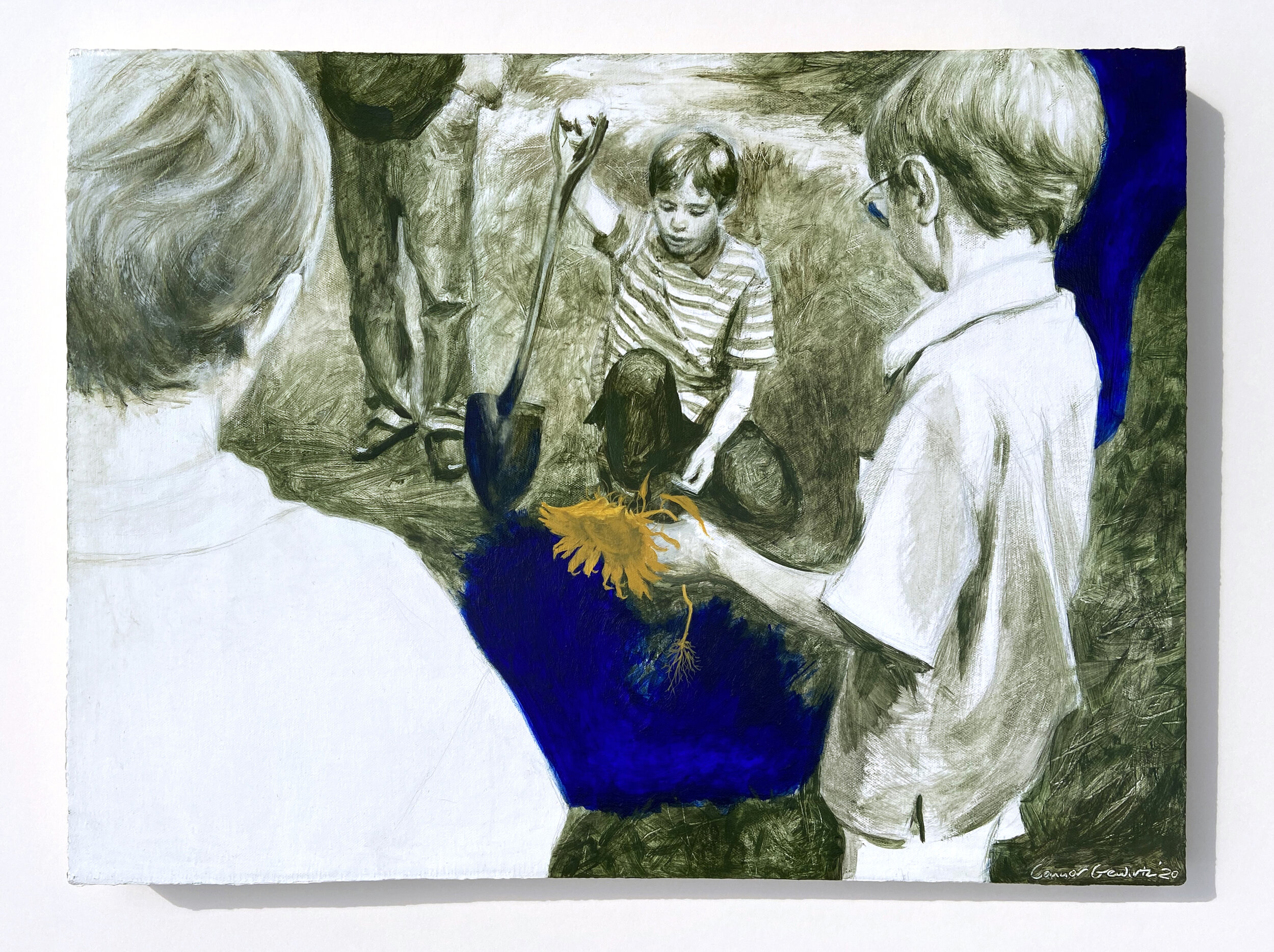
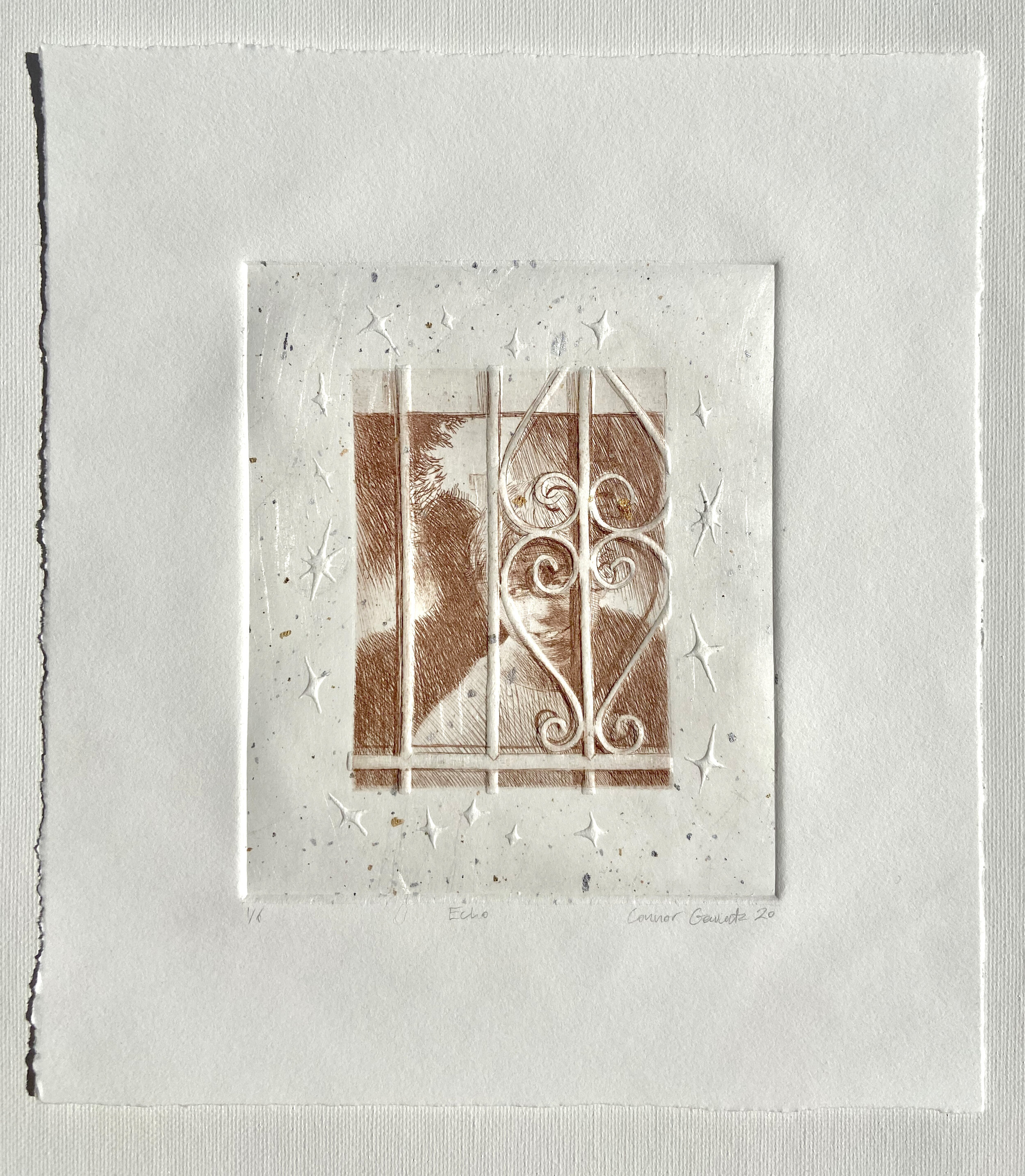
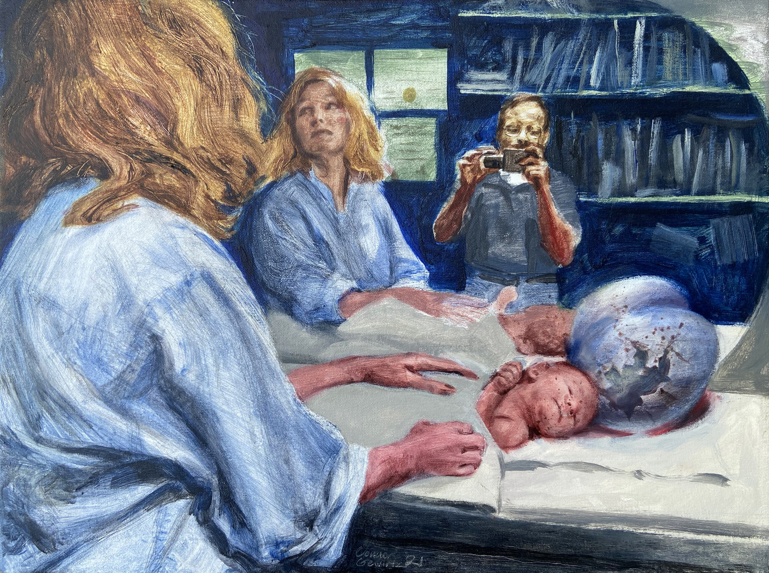
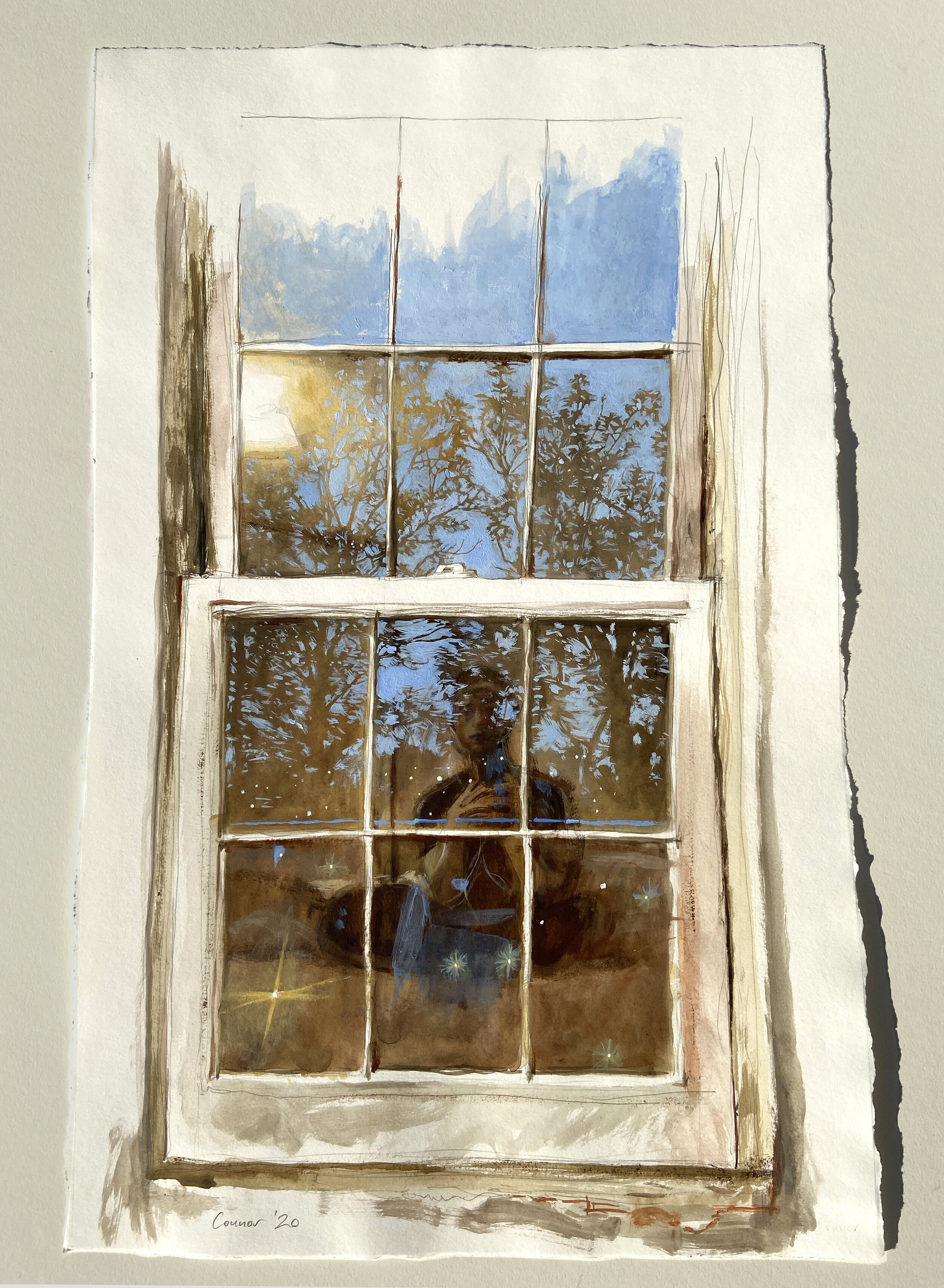
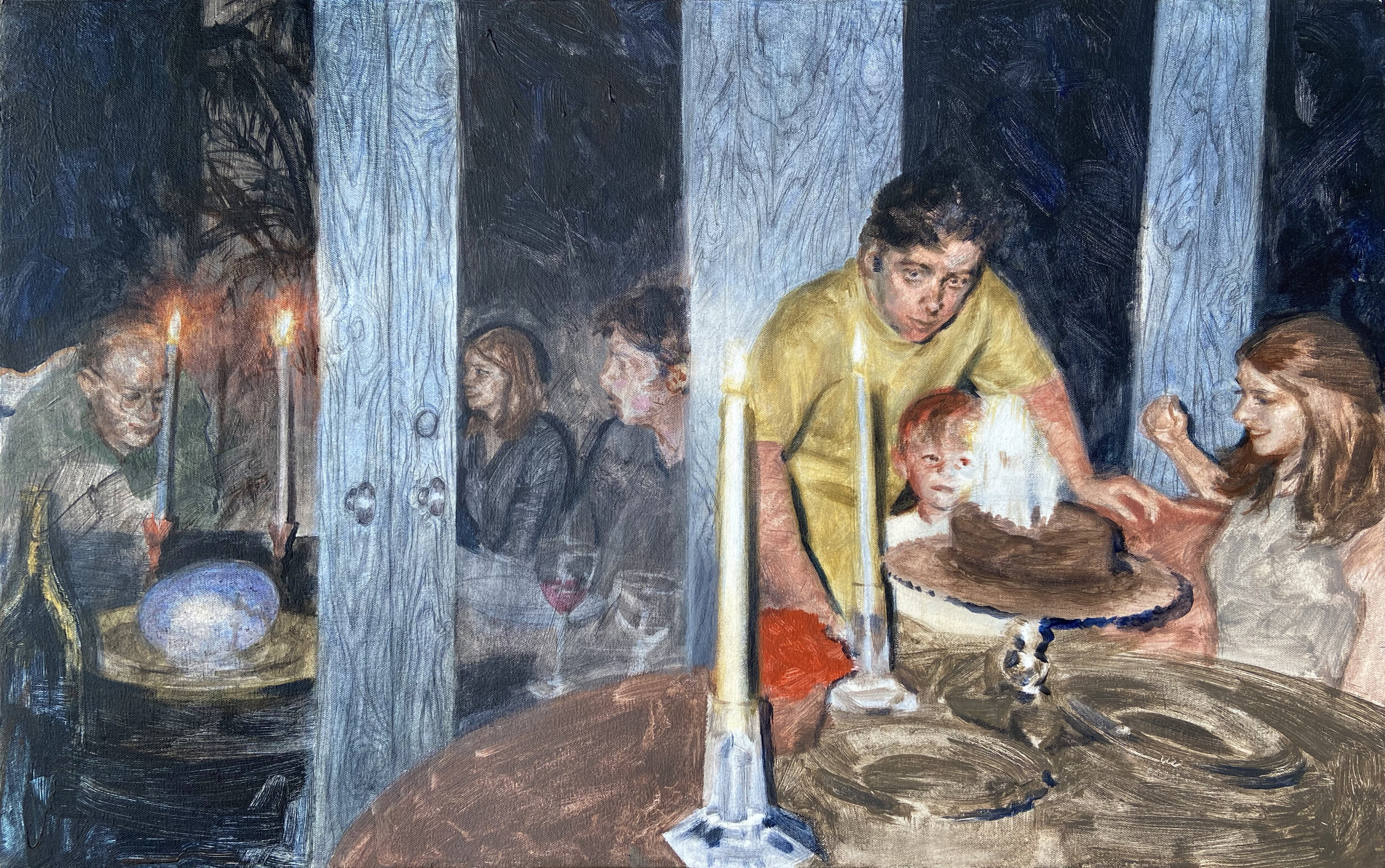
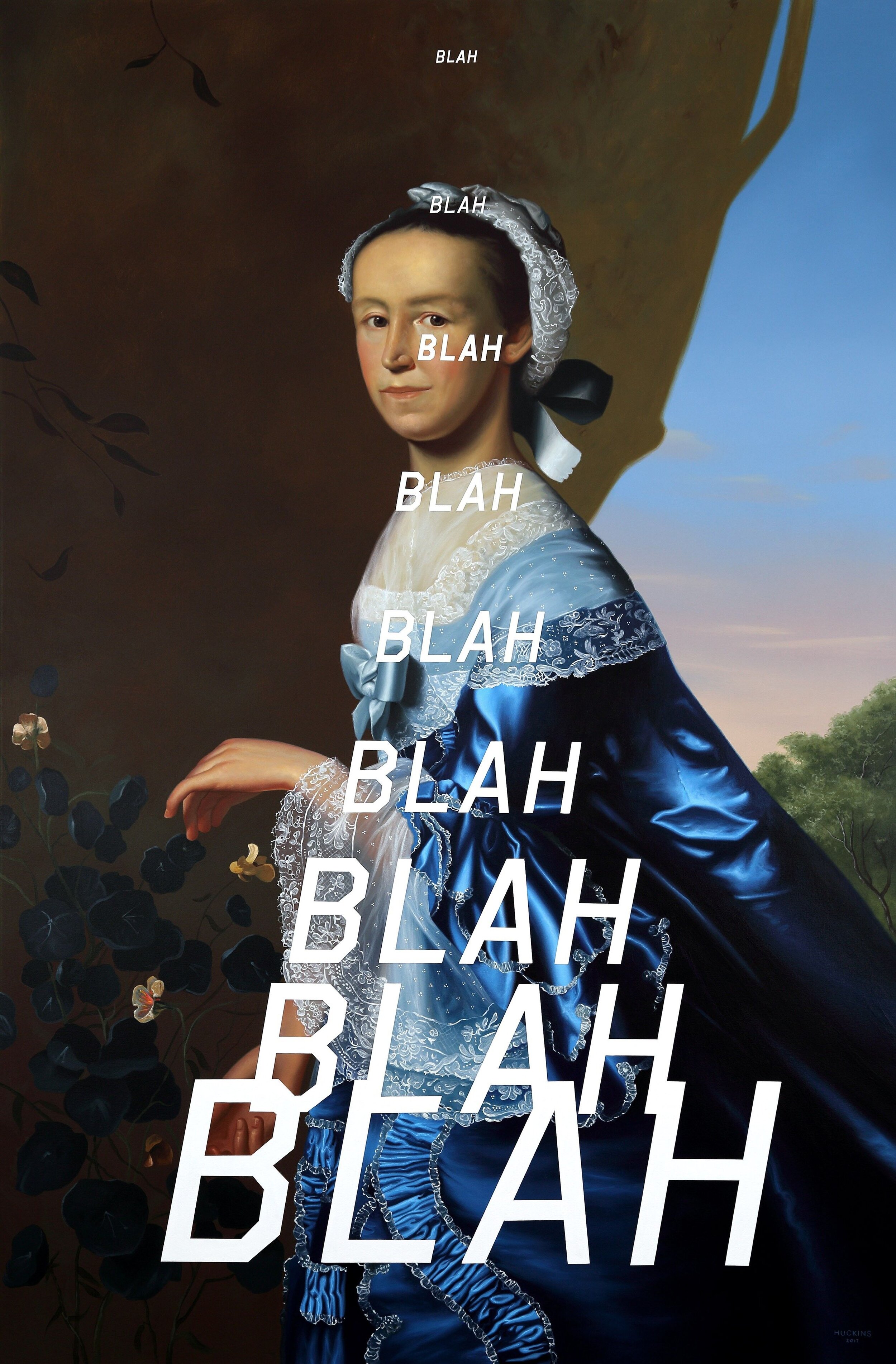
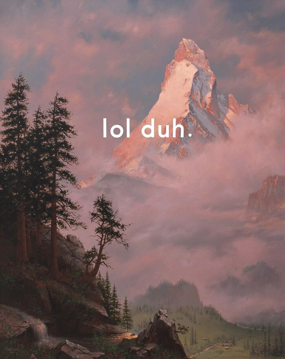
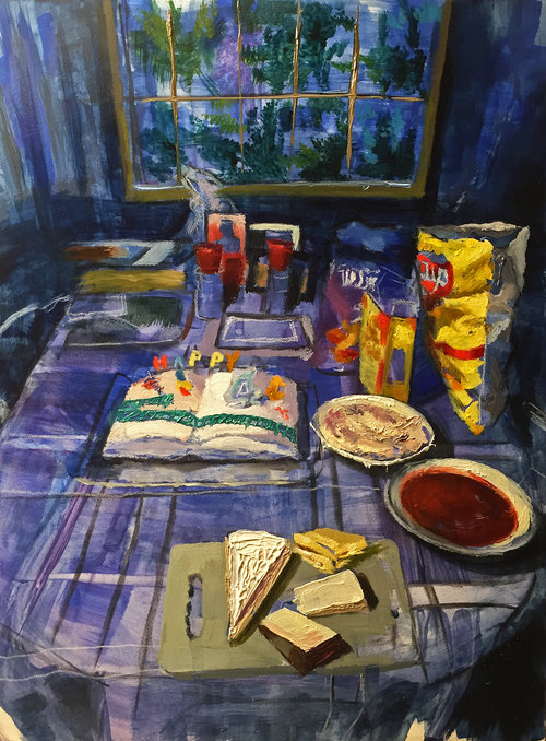
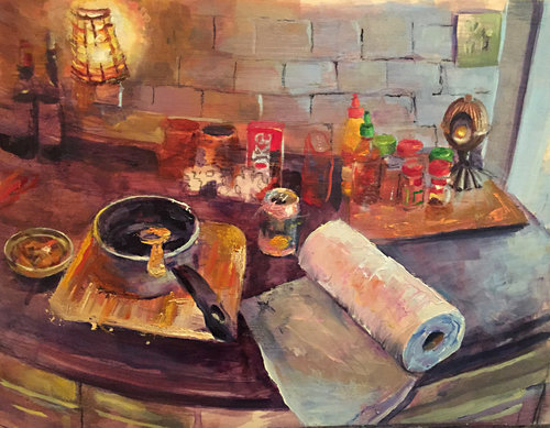
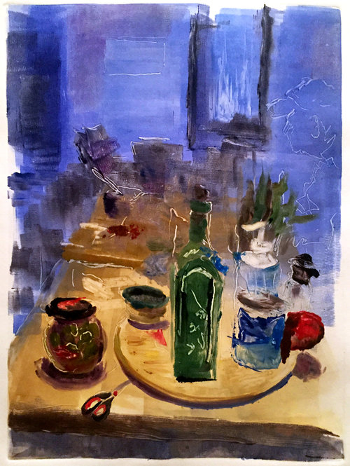
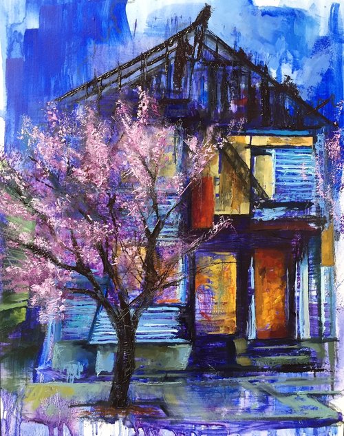
Learn more about Chris and his work at www.nocturnallandscapes.com and follow his studio on Instagram via @nocturnallandscapes. Peruse samples of his work below, and click each image for a full view of his paintings.

Ten Questions with Connor Gewirtz

Connor Gewirtz is a talented painter and printmaker who is about to finish out his senior year as a student in the Illustration Department at the prestigious Rhode Island School of Design. Connor was featured in the 2019 College Exhibition at the Providence Art Club, which I juried. At the end of that show, we selected Connor as the recipient of a special Best in Show Award that came with a solo exhibition at the Club. On view in the Art Club’s Mary Castelnovo Gallery through Friday, May 28, 2021, Connor’s exhibition Changeling shows off both his technical acumen and his unique knack for storytelling. I am thrilled to have had the chance to work with this rising talent and look forward to following his career. I am also pleased that Connor was willing to take part in my Ten Questions Interview Series to complement his show. I hope you’ll read the interview below, then join us for a special virtual Artist’s Talk on May 26, or visit the show before it closes on May 28.

-Michael


Michael: As a senior at the Rhode Island School of Design, what advice would you give to students considering an "art school" education. What are your key takeaways from your time at RISD?

Connor: Art school can provide a solid critique environment, but one thing that’s nearly impossible to teach is how to be your own artist. I came in with the expectation that I would be handed the key to making successful work but felt a bit lost when I realized this wasn’t going to happen. If I could give advice to somebody beginning at art school, I’d recommend nurturing the ideas you love within your own work rather than trying to make work for your instructors.


Michael: Your solo exhibition Changeling at the Providence Art Club contains images that touch on deeply personal themes. Can you talk about making and sharing work that reveals private stories?

Connor: I think the title of the exhibition gives a direct allusion to many of the themes within the work. I started the series by making narratively abstract works, but as I learned more about my family tree, they began to steer more into a mishmash of personal history. Much of the work is a reflection on this family tree and rethinking the traditional definition of family. 


Michael: Can you talk about your process in beginning a painting? Do you start with a drawing? Your images are intricately layered - how do they come together?

Connor: Drawing is such a vital part of the painting process. I often start by making collages and sketches and then I create a final drawing on canvas based on the best ideas. I spend the most time on the drawing stage because any mistakes in the drawing tend to haunt me when I’m building up the painting. 


Michael: The palette of your recent paintings is a key element of your storytelling. Can you speak to how you use color to delineate space and time in your work?

Connor: I try to use color in a deliberate way. Like you mentioned, I often use my palette to convey a separation between different spaces. As I’m colorblind, it can be very difficult to differentiate subtle differences in hue, so I try to have my symbolic colors contrast from the background.


Michael: Do photographs and family archives play a significant role in your work? If so, how do you utilize them?

Connor: Yes! As I mentioned, collage features heavily in my imagery. I often start working backwards from a particularly important photo by trying to find other related images that fit the idea. This process is vital to the current work as a means of tracing my own memories back to their source along with trying to demystify my own nostalgia for my past. 


Michael: You have a number of prints in your show. Can you talk about your printmaking and how it and your painting interact with one another?

Connor: I’m so thankful for getting the chance to learn printmaking. I started learning about a year and a half ago through a couple of classes across RISD. Printmaking is a big extension of my drawing process. Where painting can be time consuming for one original work, printmaking  allows me to share my drawings with far more people by creating multiples. One of the big constraints I’ve put on my intaglio is keeping it monochromatic. Where nearly all of my paintings use palettes of 5+ colors, by keeping the prints monochromatic I can focus more on linework and tonal images. 


Michael: You have been preparing for your exhibition for some time. Can you talk about your process in creating, selecting, and editing the body of work you chose to share?

Connor: It was a total surprise to get the opportunity to do the show, so I started totally unprepared. Over the course of the year I went through at least five different series. The final presentation is only about a half of the number of pieces that could have fit thematically, but given the space I had to make some serious cuts. 


Michael: You also installed your own exhibition at the Art Club. I think many artists find installing shows to be a difficult task. Can you speak to your vision for the show and how you decided to hang your work?

Connor: I invested so much time in making and preparing the work that I wanted to have a hand in its presentation. In the past I’ve helped other artists curate their shows, so it felt right to finally do it myself. The work is hung in groupings that connect thematically with each other.


Michael: Although a young artist, you have already developed a great resume of exhibitions, awards, and residencies. What advice do you have for emerging artists on finding opportunities and sharing their work?

Connor: Hahah well I guess that’s true, but it still feels like I’ve barely scratched the surface. The only advice I can give for exhibiting is to keep working until you have a solid handful of connected pieces that resonate with you. 


Michael: As you finish up school and consider your future plans, what's next for you? Where do you see yourself going both creatively and professionally

Connor: I’m going out on a limb and moving to NYC with the hope of being able to continue making and showing my artwork. Wish me luck!


Connor’s solo exhibition Changeling is on view in the Mary Castelnovo Gallery at the historic Providence Art Club through May 28, 2021. Gallery hours are Sundays - Fridays, 12-4pm each day. Connor will also be participating in a free Artist’s Talk on Wednesday, May 26 at 6pm Eastern Time. Register for Connor’s talk on Eventbrite. To inquire about Connor’s exhibition, email michael@providenceartclub.org.

You can also learn more about Connor at his website connor.art and you can follow him on Instagram at @connorgewirtz.

Ten Questions with Shabnam Jannesari

Shabnam Jannesari is a talented figurative painter and a student working toward her Master of Fine Arts degree in the graduate program at the College of Visual & Performing Arts at the University of Massachusetts Dartmouth. A native of Iran, Shabnam’s paintings depict figures of her family, friends, and herself. She often explores the position of women in Iranian society and utilizes a palette that both invites the viewer into to each largescale composition, while also remarking on elements of Persian design. I featured Shabnam in my 31 Under 30 Virtual Exhibition in 2020, and was happy to have the opportunity to visit her studio and explore her paintings close up. Shabnam is the subject of a solo exhibition at Gallery 263 in Cambridge, Massachusetts on view through February 13, 2021. In the most recent installment of my Ten Questions Interview Series, I spoke to Shabnam to learn more about her work, her background, and her exhibition. I hope you’ll read the interview and then explore more of her work!

-Michael


Michael: What brought you to the MFA program at The University of Massachusetts, Dartmouth and how are you liking it?

Shabnam: After I saw professor Suzanne Schireson’s paintings and interviewed with her, my wish was to work under this amazing artist.

Michael: How do you begin a painting? Do you utilize photographs in your process? 

Shabnam: Yes, I use photographs which I took from my home. First, I collage multiple photos and then I start painting. Though I work with paint, I am interested to maintain the immediacy of drawing and to avoid rendering my forms too closely. Working in this way allows me to experiment with form, color and abstraction in the imagined spaces that I paint for my figures. 


Michael: You tend to work on unstretched canvas on a wall. Can you talk more about that?  

Shabnam: I exhibited my paintings at Gallery 244, located at University of Massachusetts Dartmouth, unstretched and pinned to the walls. The feedback I got from one of my professors was that the flatness of the unstretched canvas supports the concepts embodied in my current work. Recently I have stretched my paintings and put them in the Gallery 263.

Michael: Who are the subjects of your paintings? 

Shabnam: They are my family, friends and myself. I describe friendship or familial closeness. My paintings express my personal story, but they also reflect the life of Iranians and of suppressed women. I address the complexity of Iranian female identity in an imagined space that departs from reality; producing a special, secret and supportive space. I am searching for affinities between textures, marks or color relationships and moments.

Michael: How would you like viewers to respond to your paintings, and what do you hope they take away from them?

Shabnam: I am exploring the memories and nostalgia of distant intimacies in my life through narrative, I am creating imaginary spaces from personal reference and patterns. This departure from reality is a protest of female suppression and creates a special and secret space against reality.

Michael: What two artists, contemporary or historical, are most influential on you? Why?

Shabnam: Jennifer Packer is an amazing artist who I admire. Although her work centers on Black subjects, the artist makes skin color secondary to the psychological aspects of her sitters—her use of soft hues of yellow, ochre, red, and mauve express an intimate emotional sensitivity even when the figure is doing something as mundane as hanging out on a couch in their apartment. in her art the eye contact engages the viewer. Packer’s paintings are rendered in loose line and brush stroke using a limited color palette, often to the extent that her subject merges with or retreats into the background. Suggesting an emotional and psychological depth, her work is enigmatic, avoiding a straightforward reading.

I admire Alice Neel because she changed a societal perception of women. She did not represent women as a vulnerable, passive and weak creature of male gaze in western art. She was able to change the concept of the female body from an idealistic appearance to a powerful one. 


Michael: Can you talk more about your color choices and how you develop your palette?  

Shabnam: My bright, highly saturated palette is inspired by childhood memories including a colorful carpet in my grandparent’s home. I am passionate about the carpet’s warm colors and non-repetitive intricate pattern; I could stare at this forever. Michel Foucault writes, “The traditional garden of the Persians was a sacred space that was supposed to unite four separate parts within its rectangle, representing the four parts of the world, as well as one space still more sacred than the others, a space that was like the navel, the centre of the world brought into the garden…” (Of Other Spaces: Utopias and Heterotopias). Persian carpets are famous for their elaborate colors, variety of spectacular patterns, and artistic design. It is a symbol of an ideal world or paradise. It represents the world out of convention. These are the kind of spaces I intend to build for the figures in my paintings. I am interested in heterotopic spaces, an ideal world outside of convention, a special and secret space against the real world.


Michael: Have you had a particularly influential instructor, either at UMass or before? Can you talk more about that mentorship?

Shabnam: Professor Suzanne Schireson is my primary advisor at the University of Massachusetts Dartmouth. I admire her not only as an wonderful artist also as an amazing person.


Michael: What are the goals for the body of work you’re creating in your graduate program?

Shabnam: I illuminate how Iranian women are censored by an overarching patriarchy. While my paintings are expressions of my own personal story, they can also be perceived as reflections on the life of Iranian women in general. My work addresses the complex reality of Iranian female identity from the unique perspective of personal experience. By this, I am claiming my identity in all of its complexity.


Michael: You have a solo show coming up at Gallery 263 in January. Tell us more about that.

Shabnam: Gallery 263 would offer me the opportunity to communicate with a greater audience and empower women. My work invites a dialog to reconsider assumptions about women who have been circumscribed by Islamic culture. I find that in America, society often misunderstands Islamic religion or Persian culture. Showing my work in public gives me the opportunity to connect with others and re-tell stories of Iranian culture from a personal viewpoint. I have seven paintings (approximately size 5x7 feet each) to occupy the gallery wall space. I would look forward to engaging your community with an artist talk and discussion. I have lived in Massachusetts for the past two years and I am eager to be involved with the wonderful community of artists in this state.


Shabnam’s exhibition at Gallery 263 in Cambridge, MA is on view through February 13. Gallery hours are Wednesdays–Fridays, 4–7pm and Saturdays, 1–4pm. For more information reach out to the gallery at contact@gallery263.com.

Learn more about Shabnam by following her on Instagram @shabnam.jannesari or by visiting her website at shabnamjannesari.wixsite.com/portfolio.

Ten Questions with Shawn Huckins

StudioVertical.jpeg

Shawn Huckins (American, B. 1984) is an artist based in Denver, Colorado who merges historical imagery with contemporary texts, to create technically astute and humorous paintings.

A New Hampshire native, he earned his BA in Studio Art magna cum laude at Keene State College and is represented by galleries in Denver, Seattle, and San Francisco. His work has been published widely and he has earned a number of awards and grants for his work. He his shown his work around the United States and internationally, with a new solo exhibition Happy Go Lucky opening at Galerie Bessiéres in Chatou, France, this October.

I have followed Shawn’s work for some time, along with his thousands of other followers on Instagram. I enjoy the way he mixes art historical tropes with language of our time. His unconventional paintings pair his skills and sense of humor to create images that are fun and exciting.

-Michael


Q1. Your paintings are very labor intensive. What steps go in to making one of your paintings and about and how long do they take to produce?

A1.  The beginning stages of my paintings all begin with playing around on the computer.  Once I find a text phrase to marry with a classical portrait, I will play around in Photoshop with text size and placement over top an image of the portrait I’m going to replicate from the 18th/19th century.  Once I’m happy with the final composition, I will draw out the entire image (including drafting out the text) onto plain white canvas.  From here, I will mask off the text with tape and begin the underpainting.  After the painting is complete and I’m satisfied with the end result, I will remove the tape to reveal the white lettering below.  I will then touch up the letters with white paint, as sometimes the portrait portion of the painting will seep below the tape.  From beginning to end, it takes generally 2-3 weeks to finish a mid/large painting.  Smaller works can take a week and my largest canvases can take up to two months.

Q2. Your work regularly references art historical subjects. What attracts you to specific historical works?

 A2.  I think the first thought is ‘can I replicate this in a convincing and respectable manner?’ I’m really drawn to fancy clothing and detailed lace, which add times to the production process, but the end results are stunning.  I typically veer toward more realistic portraits rather than gestural works, since my work is realistic based.  I have done more gestural, ‘painterly’ paintings in the past, but I’m more comfortable with realism.

Q3. Do drawings and preparatory studies play a large role in your process? If so, how do you utilize them?

A3.  I typically only do drawings, or small paint studies when I’m trying a new technique.  I use small, cheap canvas board to do my experiments before applying them to the larger, final painting.  Most of prep work is done on the computer in regards to getting the composition correct.  For very large works with tons of detail, I will draw detailed drawings of portions of the painting onto trace instead of drawing on canvas, as to not dirty up the white canvas too much.  Once I have my drawings on trace finalized, I draw it in reverse and rub the drawing onto the canvas.

Q4. Text is a major component of your work. How do you decide your text and image pairings and what are your goals in these?

 A4.  Deciding which text goes with which painting isn’t really a science.  It just was feels right.  I will take into consideration if the portrait is male or female, their posture, and the look on the face.  I have a very large document containing texts I’ve collected over the years which I scout for on social media.  I rarely, if ever, use my own text as I feel it would be too contrived.  The goal is to capture the digital language of today and to show the debasement of language as it becomes shorter (ie, LOL) and grammatically incorrect.

Q5. You have exhibited widely. What do you hope audiences take away from viewing your paintings?

A5. The main goal is to make people smile and laugh.  Yes, I’m talking about the de-evolvution of the English language and how communication skills are suffering due from the rise of technology, but if you smile, that’s the joy in it for me.  During my last show in Seattle, my partner was standing by the door and overheard people as they were coming in for opening night.  He saw people’s faces light up and smile as they walked in and overheard one couple saying ‘we need more people like him in the world.’  That made my whole night.

Q6. Who are other artists working today that you admire and why?

A6.  There are so many great artists today and it’s so easy to discover them by way of Instagram.  Some of my favorites are Vivian Green, Matt Hansel, and Amy Bennett. They motivate and push me to keep producing my best work possible.  Maybe it’s a subconscious artist rivalry thing, but being engaged and surrounded by the work you admire only helps you produce work that you can be proud of.

Q7. Do you feel the humor in your work makes it more accessible to a broader audience?

A7. I feel more people have a better response (myself included) if the work is playful and engaging.  I’ve never produced deep and dark themed paintings because I’m not attracted to that subject matter.  While it certainly has its place in the world, I’d rather create work that makes people smile and laugh.  I remember in college, one of my professors was trying to get me to paint subject matter that was really dark and twisted, and I just couldn’t feel it.  I think she was trying to get me to use art as a therapy session.  I use painting as a creative outlet, for sure, but not in the way my professor was seeking.

Q8. In terms of preparation, how do you frame your work? Historical works like those you reference may have been framed extravagantly. Do you prefer more traditional or contemporary frames?

 A8. I prefer the no-frame method. I like the contemporary look using the thick canvas stretcher bars as the frame for the classical painting to give it a nice contrast along with the text.  This option also allows the collector to choose what they feel is right for their homes (if they want a frame).  Collector’s have sent me images of their paintings in simple maple floater frames, or another chose to have their painting in an ornate, gold leaf frame.  I think both look great.  I would choose the simple, maple floater frame.

Q9. You mostly utilize historical imagery from the eighteenth and nineteenth centuries. Have you or would you consider working from other periods or other types of underlying images?

Q10. What is the next major project you’re working on?

A9./10. I’m working on a new project which will debut in June 2020 at K Contemporary in Denver.  It involves working with Roman sculpture from around 100 - 300 A.D. time periods.  I’m moving away from contrasting classical paintings and digital text to Roman sculpture and the American discourse.  It’s basically a new series of destruction and rebirth, but again, in a playful, engaging manner.  I am very excited to start this.

Ten Questions with Lydia Mozzone

Lydia Mozzone_In Studio.jpg

Lydia Mozzone is an artist living and working in Boston’s North End. Lydia’s work has exhibited her paintings at the Connecticut Academy of Fine Arts, the Lore Degenstein Gallery in Selinsgrove, PA, and in a two
person show at the Cape Cod Cultural Center, South Yarmouth, MA alongside her mother, Michele Poirier-Mozzone. Her work recently gained regular representation with Coastal Contemporary Gallery in Newport, RI.

Lydia is a painter whose figurative work explores the complex relationships between women and their bodies within the context of contemporary life. She earned her undergraduate degree in studio art at Skidmore College.

In 2018, I selected Lydia as one of ten “Artists to Watch” for Boston Accent Lit and I have continued to follow her work. I am thrilled to share this interview with a talented emerging artist with you.

-Michael


Q1. Your work is primarily figurative and focuses on the nude. Do you have regular models for your paintings or do you work from photographs, memory, etc?

A1. I use photographs I've taken of roommates and friends through a foggy glass shower as reference for my paintings. Using a photo lets me map out my canvas and refer to the image until I'm happy with my drawing and composition. Then, I can put down the image and react to and enhance what the paint is doing organically. I find this process to be very freeing.

Q2. The nude has a long tradition in art history. Do you see your work in conversation with historical precedent or as a departure from past works predominantly created by male artists?

A2. Many classical nudes portray a confident woman who is acknowledging the viewer; she might be looking directly at us, making little effort to conceal herself. I admire these historical paintings, but I do see my work as a departure from that point of view. My "ladies" are very much about of the complicated relationship the modern woman has with her own body rather than a depiction of confidence and sexuality.

Q3. You studied art at Skidmore College. Can you talk more about your educational background and the role it played in shaping your work?

A3. For the first two years as a Fine Art major at Skidmore, we drew the figure and still-life in charcoal. Regardless of concentration, each student had to spend many hours perfecting proportion, perspective and composition in charcoal before exploring other mediums. I think Skidmore's approach directly inspired my "style" once I discovered oils. I have an obsession with realistic figurative areas interacting with loose, textural spaces in a painting. I still do remain more technical at the beginning of a painting, and then let the handcuffs off to achieve the organic marks I love.

Q4. You have shown your work previously at other venues. But what role do you see your relationship with Coastal Contemporary Gallery playing in your career as a fine artist?

A4. Coastal Contemporary is the first gallery to represent my paintings. I'm thrilled to be showing my work in Newport, and am especially excited to have Shari (the director and owner of Coastal Contemporary) representing my paintings. She is an incredible artist herself and has such an elegant and approachable way of speaking about and curating the work in the gallery.

Q5. Your mother is also an artist, Michele Poirier-Mozzone. How has having another artist in your immediate family influenced your development?

A5. My mom has been the biggest influence in my life artistically. She taught me to draw as a kid and has been providing unfiltered, honest critiques ever since. Each of us has turned areas of our homes into a painting studio. Having a home studio is convenient but isolating, so we’re constantly texting images and calling each other to bounce ideas and critiques back and forth.

I'm extremely lucky to have her support as I carve out my own art career. Her work has inspired me to appreciate deliberate brush strokes, to diversify my "go-to" color palettes, and to keep evolving and challenging my own series of work.

Q6. You've mentioned the importance of drawing to your paintings. Do you exclusively work in charcoal? And are your drawings strictly preparatory or would you consider exhibiting them as finished works?

A6. As a student, I worked in charcoal and graphite constantly. Now that I work mainly in oils, I use graphite pencils to sketch composition ideas for larger paintings. When I move to the canvas, I draw out the composition again with a thin brush and oil paint. I no longer treat my drawings as finished works, but I do think it would be really interesting to explore my series in charcoal or graphite one day! 

Q7. Speaking of influences, what famous artist(s), historical or contemporary, are you currently inspired by and why?

A7. I look at Gerhard Richter for his beautiful lost edges. I love Alex Kanevsky's figures - his compositions are always so unique and I admire his ability to boldly integrate a flesh tone into a cool background and vice versa. I'm also inspired by Jenny Saville's juicy, gestural strokes; her marks make her paintings feel so emotional.

Q8. You work in a variety of scale from 8" x 8" to works that near life size. What role does scale play in your work?

A8. For years I rarely worked on canvases smaller then 4 feet. Painting the figure at a life-size scale is a really cool exercise; it's a very physical process requiring movement of the whole body. Lately I've been working at a much smaller scale. Initially this transition was out of necessity, as I couldn't fit large stretchers into my apartment, but it has challenged me and taught me a lot. It's much easier to overwork a smaller painting - but smaller canvases also lend themselves to making bolder, textural marks, which I find really exciting.

Q9. Can you speak more to your painting process? Do you create the distinct textures using brush or palette knife or both? How do you develop the unique qualities of your surfaces?

A9. I use a mix of palette knife and brush strokes throughout my painting process. I find I can capture an atmospheric "foggy" feeling best when painting "wet into wet" - so often I'll go over a whole dried canvas with Galkyd medium before going back into it. I try to mix hard and soft edges in my paintings - blurring the background into the figure in some places, and using harder lines elsewhere. I use the palette knife to keep a sense of immediacy and spontaneity throughout my process. I try not to overthink it (though that's easier said than done!).

Q10. What projects are on the horizon for you and how do you see your work growing or changing?

A10. I think it's important that a series of paintings never becomes too formulaic - so I'd like to continue to keep pushing myself out of my comfort zone. Now that I've been working at a small scale, I think it would be really interesting to see how these smaller works would inform my process if I go back to very large pieces. I've also been thinking about using a spotlight in the shower, pumping up the contrast and drama in my pieces.

Rhode Island Artist Survey 2019

This year, I am conducting a survey of artists based in Rhode Island in order to learn more about the market for works of fine art by local artists. This survey is anonymous and takes just three minutes to complete. If you are an artist based in Rhode Island, please consider taking my survey to help me form a more accurate image of the realities of our regional marketplace. This brief questionnaire seeks to gauge price points, sales, and strengths and weaknesses of the market from the eyes of artists.

This survey will be available through February 28 and, should enough artists participate, I will post the results with analysis here on my blog at michaelrosefineart.com. You can click the button below to head to the survey:

Ten Questions with Michelle Benoit

Screen shot 2018-09-22 at 7.58.43 PM.png

Michelle Benoit is a contemporary artist based in Rhode Island who utilizes translucent and toned Lucite to create minimal and enticing forms. She holds a BFA from Rhode Island College and earned her MA and MFA at the University of Iowa. Michelle’s artwork rewards extended looks and deep consideration. In the following ten questions we talk about her work, process, and more. Read our conversation and explore Michelle’s work on her website or her Instagram. Her work can be found at Memorial Sloan Kettering, the University of Iowa Museum, and in numerous private collections. She has exhibited widely and is represented by galleries in Scottsdale, Philadelphia, New York, Frankfurt, and Milan. She recently was the subject of a wonderful show at AS220 in Providence, RI and is now featured in the exhibition Object/Subject: Two Voices at Margaret Thatcher Projects in New York through October 13.


Q1. Can you talk about how you get started on a piece? Do you create preliminary sketches or studies, or what other preparation is involved?

A1. I purchase and occasionally collect scraps of Lucite. So the compositions have to conform to the size, shape and availability of the remnants. After we cut the components I work with the materials for a bit, stacking, looking at how the shapes receive light, and the various possibilities.  From here I often sketch out ideas of what the possibilities could be once I adhere and re-cut the shapes. I respond to the material throughout the process and there is always an element of the unexpected.

Q2: Your work has a feeling of precision. Do you consider your process precise or is there an element of spontaneity?

A2. I have discovered that this material is entirely unforgiving. So there is a certain amount of exactness that has to happen while cutting and clamping the work, so that the piece can withstand the continued cutting in addition to retaining the applied color. I intentionally never really know what the work will look like and always respond to a work when it is uncovered from the clamps. It is on very rare occasion that the work does not need further manipulation either by additive, subtractive or both processes.

Q3. Color plays an important role in your work. Can you speak more to your palate and how you select colors for your work?

A3. Color is symbolic of time for me. For this exhibition Laminae, I have chosen colors from my childhood bedroom. During graduate school I had found old fabric from curtains that we had sewn when I was quite young. I also chiseled into the walls to reveal the layers of colors over the years and applied an adhesive to these things and peeled them away, the colors absorbed permanently in the glue. The color in this exhibition is extracted from that time there with my sisters and those that were there before us.

Q4. Though there are clear differences, your work is reminiscent of the colorfield paintings of Mark Rothko, who you have cited as an influence. Can you discuss how Rothko or other artists have impacted your work and how you seek to change or improve upon his or other artists' ideas?

A4. For me there is an extremely powerful exchange of energy when in the presence of a Rothko painting. I think to some extent there is an element of silence that allows for this reciprocity to be initiated. While I could never hope to improve on what he has accomplished, I can collect fragments of my life through color and give them a shape to see what it looks like.

Q5. Your work references time, memory, spacial experience, and other topics. What, if any, advice do you have for audiences looking at your work on how to view it, and how to engage with it?

A5. I have been working on a diagrammatic drawing of a personal color symbolism. It is fluid and an ongoing project which may have various iterations in future exhibitions. But for now, I can hope that something in the work would give pause, or slow time for just a moment to evoke consideration from the viewer.

Q6. You exhibit widely and have international gallery representation including in New York, Frankfurt, and Milan. What advice might you give emerging makers looking to develop their own careers as exhibiting artists?

A6. I highly recommend taking advantage of social media. If you are persistent you can expose your work internationally, finding your audience. I have also made great connections with other artists that I otherwise would not have.

Q7: Your work tends to be more intimately scaled. Can you speak more to the size of your works and how you find the right scale?

A7. Much of my work is determined by the size of the fragments that I buy. Additionally the intimacy of small scale works is always something that I am drawn to. A goal is to attempt to, catch and redirect light with these materials. To some extent I can only work to the scale of my current tools and the fragments that I buy. But I do have ideas and some sketches for larger works that I am looking forward to having a bit of time to start experimenting with these thoughts. I hope to merge the intimacy often found in  small scale works to the experience that seems to happen with larger scale artwork. This may be impossible, but it is something that I am working on.

Q8. You have a large following on social media including over 7,000 followers on Instagram (@michelle.benoit). Does this impact your practice or influence the way your engage with new peers, gallerists, or potential collectors?

A8. I am working in the studio seven days a week do to prior commitments with galleries. Additionally we are restoring our 18th Century farmhouse while we are living in it. So I have very little free time lately. I often use Instagram to get some much needed separation from the work and also some feedback. Conversations with collectors can be very different than those with my peers.

Q9: Can you share the process behind preparing for your recent show at AS220? Was all the work made specifically for this exhibition, how long have you been working on this show, and are there any other details you might like to share?

A9. The AS220 opportunity came up just a few weeks before the exhibition. I had signed up to show at the Project Space about 3 or 4 years ago and remember a pretty long waiting list.  My show ‘Laminae’ was happening at McKenzie Fine Arts in NYC and I was working on new pieces for my exhibition at Margaret Thatcher Projects. Because I was working under the same continued theme I combined a selection of works from each exhibition for the AS220 show. It took about a year to make all of the work for this show.

Q10: What forthcoming projects are you most excited about? What's next for you? 

A10. Currently I am working on my solo exhibition at Morotti Arte Contemporanea, in Milan Italy for November so of course I am excited about this.  I was recently invited to a group exhibition at the college of William and Mary that is part of an interdisciplinary research project with the neuroscience department. The group of artists that I will be showing with are pretty fantastic and I am just really ecstatic that a connection was made between my work and a project in neuroscience. And I am very excited about my show Object/Subject:Two Voices with Kevin Finklea at Margaret Thatcher Projects. This show runs through October 13th.

You can learn more about Michelle at her website, michellebenoit.net.

Martin Puryear is Perfect for The Venice Biennale

The Trump Administration's tardiness in announcing which American artist would represent the United States at the forthcoming 2019 Venice Biennale was incredibly unusual. And it lead some to speculate that partisan officials were plotting to push the selection of an artist who would exhibit work that represented Trump at the expense of artistic quality. Thankfully, that was not the case and a few days ago it was announced that Martin Puryear would create new pieces for the United States Pavilion at one of the most important events in the international art world. Puryear is in many ways the perfect choice to represent the United States in 2019, with a decades-long body of work that is an effective  foil to the Trumpian zeitgeist.

The 77-year-old Puryear, a native of Washington DC, earned his undergraduate degree in Fine Art from the Catholic University of America in 1963 and holds an MFA from Yale. He served in the Peace Corps in Sierra Leone and studied at the Royal Swedish Academy of Arts as well. He has been featured in the Whitney Biennial three times. MoMA, SFMoMA, MoMA Fort Worth, and the National Gallery collaborated on a traveling retrospective of his work. The recipient of both a MacArthur "Genius Grant" and a Guggenheim Memorial Foundation Fellowship, Puryear received the Gold Medal in Sculpture from the National Academy of Arts in 2007. He was awarded the country's highest honor for artists, the National Medal of Arts, in 2011 by President Obama. In short, Martin Puryear has the pedigree of an artist who should be featured at the Venice Biennale.

Puryear is also multi-talented. He is primarily a sculptor, but has also created furniture, tools, and other non-art objects. His work is often large scale and regularly commissioned for the public sphere. In 2014 he unveiled his Slavery Memorial on the campus of Brown University in Providence, Rhode Island. The work takes the form of a half-buried ball and chain. The ball emerges from the ground as a bronze dome with a chain jutting towards the sky where it terminates in a broken link. At the breakage, the chain is polished to a mirror finish, reflecting the sky and trees above. On a granite plinth nearby, a plaque displays a text remarking on the ways in which Brown University profited from the international slave trade and the unpaid labor of Africans and African-Americans. It is an incisive and moving piece that calls to account for historic wrongs committed by the University that commissioned it.

Brown University Slavery Memorial, Photo via Brown Univeristy by Warren Jagger

Brown University Slavery Memorial, Photo via Brown Univeristy by Warren Jagger

Puryear is an artist who is not only concerned with the conceptual, but also with the craft involved in making objects. As a result, his work is often both formally and conceptually complex. His large scale sculptures have an inkling of abstraction but also reveal narratives that reflect the real world. One of his most notable works, Ladder for Booker T. Washington (1996), shows his dedication to craft and thoughtful construction as well as his interest in history, politics, and sociology. The piece is a dramatically foreshortened and abstracted ladder that appears to recede into the far distance. It was constructed utilizing a single ash sapling hewed from Puryear's own New York property. The sapling was split precisely down the center and connected with maple rungs. Although it is essentially an abstraction, Puryear's Ladder is also a highly familiar and recognizable object. And it tells a story, too.

Ladder for Booker T. Washington, wood (ash and maple), 1996, The Modern Art Museum of Fort Worth

Ladder for Booker T. Washington, wood (ash and maple), 1996, The Modern Art Museum of Fort Worth

Booker T. Washington  was one of the most prominent thinkers of his generation. An advisor to Presidents Roosevelt and Taft, Washington advocated for African-Americans in a variety of ways but suggested that through industrious pursuits they could improve their own opportunities in the United States. This idea made him the intellectual counterbalance to other intellectuals like W.E.B. Dubois, who sought political routes and protested to broaden civil rights for African-Americans. Puryear's Ladder for Booker T. Washington suggests the winding road of progress that comes with proposed self-improvement. It also reflects the idea of the sometimes-apocryphal "American Dream" in which raising one's own status through labor and entrepreneurship would allow for a rise up the societal ladder.

In this piece, Puryear punctures Washington's arguments by suggesting the fraught nature of self-improvement for groups of people who are systematically disadvantaged by the political structures of their society. Puryear ironically utilizes his own skills and industriousness to undermine the idea that these qualities alone can change the course of an individual life. The work is quintessentially American and plays on many preconceptions about American life. It is a great expression, not only of an idea about African-American history, but also of the experience of a broad swath of the American public. It successfully combines craft and concept to educate and inform viewers.

In another large scultpure, Big Phrygian (2010 - 2014), exhibited at Matthew Marks Gallery in 2015, Puryear uses painted red cedar to created a monolithic version of the Phrygian Cap which was worn historically to denote liberation. During the French Revolution les sans-culottes often donned le bonnet rouge as an additional sartorial statement of their ardor for liberté. The use of such headgear to mark free men in the eighteenth century is likely a bastardization of the pileus, another type of hat, which in antiquity was the sign of a manumitted slave. Re-contextualized for the American scene, Puryear's Phrygian suggests the incomplete work towards emancipation, justice, and a liberal society. Through this comparison between American democracy, Revolutionary France, and their ancient antecedents, Puryear comments on the veracity of claims about American exceptionalism. His cap is impractically enormous, not meant to don a head, but to demarcate space.

Big Phrygian, painted red cedar, 2010-2014, Glenstone Museum, Potomac, MD

Big Phrygian, painted red cedar, 2010-2014, Glenstone Museum, Potomac, MD

For both his exceptional skill and his exquisite use of sculptural craft to evoke American historical and political realities, Puryear is not only a justly respected American artist, he is a fantastic choice to represent his fellow Americans in Venice. He will also be the second consecutive African-American artist to be featured in the Biennale's United States Pavilion. It is fitting, too, that his work in Venice will be commissioned by the Madison Square Park Conservancy, which recently collaborated with Puryear on his Big Bling installation. The Park's Deputy Director and Senior Curator Brooke Kamin Rapaport will spearhead the project, representing New York's cosmopolitan tastes on a global stage.

Madison Square Park was notably the site of the installation of the Statue of Liberty's flame bearing arm from 1876 - 1882 as fundraisers sought to publicize the donation of the sculpture from the French in order to pay for its base. It is appropriate that in our current political climate, a craftsman, an African-American, an artist who has commented on the American experience through his work, should show the world what Americans are thinking and making now. And it is interesting that the patron of this work will be New York City, one of our nation's most open, most liberal, most international metropolises.

Whatever Puryear creates for the 2019 Venice Biennale will bear the mark of his singular sculptural acumen, and it will also certainly share the very best of American culture with our neighbors around the world.


Additional Resources to Learn about Martin Puryear:

Vivacious Shapes: Justine Hill's Paintings at Denny Gallery

Justine Hill (b. 1985) is a Brooklyn-based painter who, in her own words, "collages different ways of making marks to accomplish a desired texture, color, or opacity for each form. Most marks are made from paint, crayon, pencil or pastel. The final painting is simply a composite of these varied marks and based on their formation can behave as animated creature or moving environments."

Hill's current solo exhibition, Freestanding, on view at Denny Gallery on New York's Lower East Side, shows off the range of her considerable technical capabilities and the breadth of her vision. Her lively and vibrant paintings are made up of shaped, canvas-covered panels. Layers of texture and color are built up within each shaped form, which are assembled together to create complete objects. The formal elements of each unit in Hill's paintings bounce off one another, resulting in a rich and varied interplay within, without, and between her cutout panels. The work is also full of energy; producing the occasional hallucinatory vibration. Hill's paintings are, in short, exciting.

To paraphrase Denny Gallery's description of the show, the objective of Hill's exhibition is to explore how her paintings can reassert themselves in space, reacquire their background, and become “freestanding”. The show succeeds in every regard. Through her considerate use of line, color, layer, and texture, Hill transforms the viewer's understanding of her shaped supports. In some instances, the painted surface underscores a preconceived notion about the form below. In others, the surface seemingly rebels against its own panel. Hill's work keeps the audience guessing, and the details of her paintings are transfixing.

The strengths of Hill's work are in the rigorous thinking that underpins them. She explores and re-explores the potentials and drawbacks of shape, of line, of content. Her marks are at once practiced and improvisational, but always very purposeful. By utilizing traditional formal elements of construction in novel ways and by undermining or second-guessing their usefulness, the artist engages with the history of the artform. In her work Hill interrogates the very medium of painting to dazzling effect.

Hill earned her BA at the College of the Holy Cross in Worcester, MA, and her MFA at the University of Pennsylvania. She has been featured in four previous solo exhibitions at Galerie Protégé, Kathryn Markel Fine Arts, and Denny Gallery in New York, as well as at Blueshift Project in Miami. Her work has been widely reviewed including mentions in Artsy, ArtNet, Two Coats of Paint, Hyperallergic, and The Huffington Post. Her work is in numerous private collections and was recently acquired by the Davis Museum at Wellesley College. Her extensive CV, and her excellent current solo exhibition at Denny Gallery are indicative of her well-deserved status as a rising star of contemporary painting.

Freestanding is on view through March 6, 2018 at Denny Gallery.

Dwarf Set and Cyclops, by Justine Hill

Dwarf Set and Cyclops, by Justine Hill

Bookend 3, by Justine Hill

Bookend 3, by Justine Hill

Ten Emerging Artists To Watch

Since its founding in 2016, I have been the Art Editor at Boston Accent Lit, a literary journal focused on publishing work by emerging talents from throughout the country. For our two year anniversary, we ran a competition to select ten visual artists particularly worth following. What follows is my congratulatory essay to the selected artists published in Boston Accent Lit and the list of selected artists, linked to their work on the Boston Accent Lit site. Thank you to Boston Accent Lit's Founder and Editor-in-Chief Sarah O'Brien for supporting the visual arts in this publication, and for adding her thoughts to this essay in parentheses.

Boston Accent Lit was founded in 2016, and over the last two years we have published the work of numerous writers and artists. As Boston Accent’s Art Editor, I try to share a diverse range of work being made by artists today. It seems that now there are more artists, more types of media, more approaches, more points of view than there had been at any previous point in history. For the two-year anniversary of the journal, we mounted a contest to find ten emerging artists particularly worth following going forward. The artists selected represent some of the diversity present in visual art, and represent a small cross-section of some of the myriad approaches, from traditional painting technique to collage-based creating to performance, being used by young art-makers. Their works explore a range of subjects—taking on topics such as self-reflection (seen in Lydia Mozzone’s paintings of naked women celebrating their beauty in solitude), family dynamics (conversations to be found within Casey Cullen’s photographic work in Nicaragua), and healing trauma (depicted stirringly in Taylor Maroney’s oil portraits in which sitters indicated places on their bodies that held the most emotional stress). Most importantly, each of these ten innovators brings their own style to the table and they share art that is uniquely personal, honest, and, in some cases, even confessional.

It is only fitting that, as an editor in a literary setting, I should draw on poetry to contextualize the work of these artists. In his 1818 poem, “Endymion,” John Keats wrote, “A thing of beauty is a joy for ever: Its loveliness increases; it will never. Pass into nothingness…” (read an excerpt of this piece here). Setting whatever the academic interpretation of this might be aside, it is a reminder that a great work of art is inherently resilient to the changing tides of fashion, taste, or history. Each of the emerging artists selected for inclusion in this issue imbues their work with some of the qualities that make worthwhile art immune to the erosion of time: depth, originality, beauty, et cetera. It will be exciting to learn where each of these artists ends up, how their work evolves, and which paths their artistic careers pave as they craft their roles in the larger art community. Everyone at Boston Accent Lit is thrilled that we could play a part in sharing the work of these ten artists with you.

Selected Artists:

Matthew Awoyera Jr.

Chelsea Coon

Abba Cudney

Casey Cullen

Sarah D'Ambrosio

Neda Kerendian

Traci Marie Lee

Taylor Maroney

Lydia Mozzone

Britny Savary-Bersani

We will continue to share works of art in all media, by artists from a broad spectrum of backgrounds, belief systems, and points of view.

Thank you for reading.


Michael Rose

Ten Questions with Abba Cudney

AbbaStudio.jpg

Abba Cudney (b. 1992) was raised in Chicago, IL and studied painting and printmaking at the New Hampshire Institute of Art in Manchester, NH. Her work is focused on the theme of the interior and she employs a subtle surreality in her depictions of spaces and objects to evoke nostalgia. Abba is one of my favorite emerging artists and in the following ten questions we talk about her process and the story behind her work. Read our conversation and be sure to stay until the end for a slideshow of some of Abba's work that I particularly like. Abba has exhibited widely including a recent show which received much praise at Kelley Stelling Contemporary in Machester, NH. She will be featured in a two person show in the Fain Gallery at Temple Habonim in Barrington, RI from March 9 - May 2, 2018.


Q1. Your subject matter of choice is the interior. How do you select the spaces you depict? What's the significance of these rooms?

A1. Most, if not all, of the spaces I have depicted hold some form of resonance with me. When I began on this interior journey, all of the spaces were either my first college apartment or friend's apartments. I explored everything in front of me, everything that held a memory and story. My work then evolved to a series recreating rooms of my childhood home both occupied and empty, acting as a form of therapy almost. My art changes and evolves with the passing of time, dependent on where I am and what significance that space holds for me.

Q2: The significance of these spaces is evident in the strength of their execution. Is there any significance to the emptiness of these spaces? Any particular reason your rooms are not populated?

A2. When figures are present in a painting, photograph, drawing, etc., a story is almost automatically formed in a viewer's mind and therefore hard to stray away from. I want the objects and spaces to act as the figures, giving them their own personalities. I want people to question why objects are where they are and to create ever-changing narratives. I like to think of my rooms as self portraits almost, with a suggestion of a presence.

Q3. In your paintings, you often mix acrylic and oil. Can you talk more about your painting technique and how you developed it?

A3. I found that I never liked to start on a white surface. Working off of a base of one or multiple colors helps me not only to envision a space more clearly, but also my value structure. The acrylic helps me achieve a drip-like base layer and go in without any restrictions. The oils allow me to bring the space to life with more vibrancy and texture. After my base layer of acrylics and before I go in with oils, I draw the scene and objects with charcoal. Almost 100% of the time I will leave much of the line work. I feel as though it helps enhance the feeling of impermanence, like one is looking at a fading memory.

Q4. It seems like your process is pretty additive then. Have you ever experimented with erasure in your work, or removing layers rather than adding them? And what role does editing play in your work?

A4. A big reason why I use charcoal when I am drawing out the scene is because of its ability to be wiped away and resurfaced again with ease. In printmaking I experiment more with the reductive process, which actually helps me more with value scale and allows me to think of my scenes differently.

Q5. You cite painters as varied as Édouard Vuillard and Antonio Lopez Garcia as inspirations. What are some commonalities among artists whose work you admire, and how have they influenced your work?

A5. Many of the artists I am inspired by were a part of "The Nabis" movement and some considered "Intimists", painting the everyday contemporary life. Many of their philosophies revolved around the idea of drawing emotion out of these everyday scenes and objects. I think that what connects all of the artists I draw inspiration from is their ability to take what some see as the mundane and create a more intimate story, "a window into the soul". Stylistically, I have always admired the Impressionists and their ability to use paint in a bold and vivid way that truly brings life to a painting.

Q6. In addition to painting, you create monotypes and other prints extensively. How does your work as a printmaker influence your painting and vice versa?

A6. Printmaking, monotypes especially, is a way for me to experiment more freely. A lot of my prints begin as the "thumbnails" for larger paintings, and then morph into their own personalities. There is an element of surprise and spontaneity in printmaking that I personally find more difficult to achieve in my paintings.

Q7: In your printmaking, you often work back into the scenes with pastel or other materials. Do you feel that this additional work on your prints continues the spontaneity that the monotype process starts, or does it become more controlled?

A7. I think once I go back into a print I automatically tend to become more controlled and think longer on my decisions. It also depends on what material I am using. For example, with pastels I tend to be more careful, but if I am using watercolor crayons I am more loose just due to the way the medium wants to act.

Q8. Can you talk more about the palate you use in your paintings? How do you manipulate color to influence the perception of the spaces in your work?

A8. My palate usually depends on the space I am recreating and I tend to rely heavily on intuition in the beginning stages. I am very intrigued by the psychology of color and how it can symbolize emotions. In order to feel the intensity of my emotions, I exaggerate most of the colors in the objects and walls, and enhance the feeling of it being a dream or memory.

Q9: You paint in a studio within your home. Does this ever pose a challenge for you? I’m thinking particularly of a great diptych of your bedroom. Does being so close to a space you’re painting make it more difficult to capture it in your style?

A9. There are definitely pros and cons to having a studio in the same space you live. A few years ago I rented out a studio with other artist friends separate from my home. I miss the social aspect of that the most, being able to hear other critiques and work creatively off of each other. However, for me personally, I like being comfortable in my own space and being so close to a lot of what I paint. If I need references from life, I can just walk out of my studio and it is all there.

Q10: What projects are you currently working on, and what’s next for you?

A10. Recently I have been experimenting with image transfers on different surfaces and layering materials. I am continuing my paintings and prints, evolving and learning as I go. I am also in the process of preparing for a show that I have at Temple Habonim in Barrington, RI so that has been keeping me busy and driving me to create more frequently.

Call for Art: Ten Emerging Artists to Watch

I have been the Art Editor of Boston Accent Lit, a small online literary journal, since it was founded in 2016. Over the last nearly two years we have published the work of many talented emerging artists, so in honor of our forthcoming two-year anniversary we are hosting a competition to highlight ten young artists worthy of special recognition. The full call for art for Boston Accent Lit's Ten Emerging Artists to Watch 2018 is below and is also available on the Boston Accent site. If you know of an artist who might be interested to apply, please share this call with them!

Call for Art:
Boston Accent Lit’s Ten Emerging Artists to Watch 2018

Boston Accent Lit, a Boston-based literary journal, seeks submissions from emerging artists from throughout the United States for Ten Emerging Artists to Watch 2018. Visual artists working in all media are welcome to submit their recent work for consideration. This competition will be juried by Boston Accent Lit's Art Editor Michael Rose. Submissions are due by January 31, 2018.

About Boston Accent Lit:
Based in Boston, MA and founded in February 2016 by Sarah A. O'Brien, Boston Accent Lit aims to showcase work that is daring and innovative, as well as providing a platform for underrepresented voices. The primary goal of Boston Accent Lit is to publish quality work by both emerging and established artists. Boston Accent publishes six issues per year in a digital format, which enables us to be accessible to readers, writers, and artists worldwide. It also will publish digital chapbooks, beginning in 2018.

About the Juror:
Michael Rose joined Boston Accent Lit as its founding Art Editor in 2016. Michael is an art historian, gallerist, and advisor based in Southern New England. He has served as Gallery Manager at the Providence Art Club, one of the nation's oldest arts organizations, since 2014. Michael earned his BA in Art History from Providence College and his Certificate in Appraisal Studies in Fine and Decorative Arts from New York University. He has completed additional coursework at the Rhode Island School of Design and was a member of the Fall 2017 cohort of Practice//Practice, AS220's national professional development program for arts administrators. You can learn more about Michael at his website michaelrosefineart.com.

Competition Rules:

  • Artists must be based in the United States.

  • Submitters must be no more than 30 years old as of January 30, 2018.

  • Artists over 30 will be considered if they have not been previously published.

  • Each artist may submit up to five works for consideration.

  • Artists may also include a short statement and a biography or CV.

  • All work must be original and the product of the applicant.

  • The juror reserves the right to personally invite individual artists or those previously published in Boston Accent Lit to apply for this competition.

Ten Emerging Artists to Watch 2018 will be published in Boston Accent Lit's February 2018 Anniversary Issue. This Issue marks two years since the founding of the publication. Ten Emerging Artists to Watch will be accompanied by an essay by Michael Rose and will feature works by selected artists along with their information.

How to Submit:
To submit, please send your materials to bostonaccentlit@gmail.com under the heading “10 to Watch” with your last name in the subject line. All submissions will be considered. Submissions are due by January 30, 2018.

Contact:
For questions about submitting please contact bostonaccentlit@gmail.com, or to speak with Michael directly, please reach out to him at michael@michaelrosefineart.com.